Some links on this site are affiliate links. If you buy through a marked affiliate link, we may earn a commission at no additional cost to you. This guide is researched editorial advice; purchases should be checked against current retailer terms. Read our disclosure.
Notice the contrast already built in
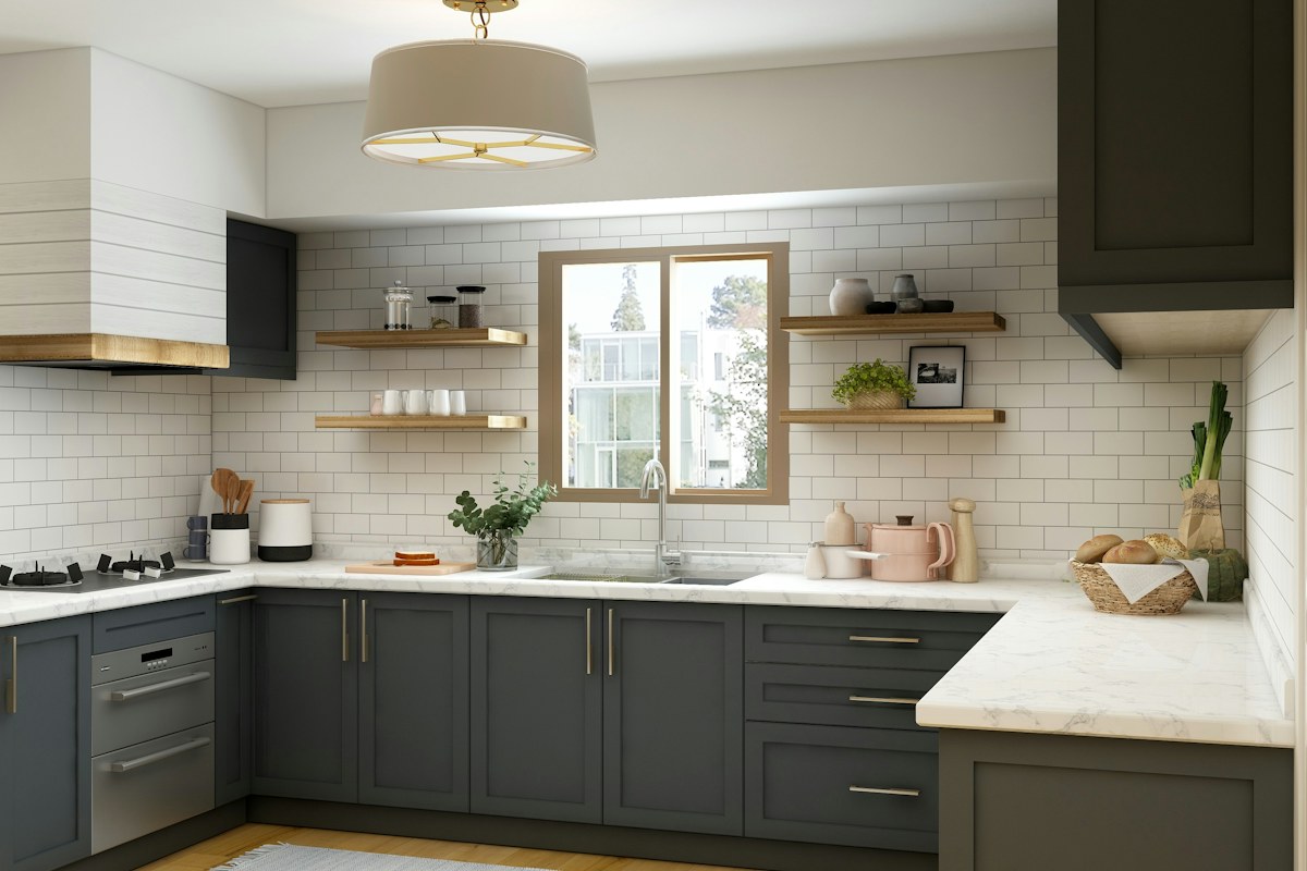
A kitchen with dark lower cupboards and pale upper ones already contains a strong color relationship. Look at the complete retained room from its ordinary entrance before choosing another accent. The contrast may be doing most of the decorative work.
Include the worktop, splashback and floor in the view. One of those broad surfaces may already connect the cabinet groups. A close photograph of a single door can make the kitchen seem less coherent than the actual room.
Name the quiet link
The link might be a pale worktop beside the upper cupboards or a warm retained surface between two painted tones. Describe it in ordinary words and keep that reference visible when comparing small objects. It does not need to match both cabinet colors exactly.
If the link seems hidden, remove one optional counter group and look again. Several little containers can conceal a broad connecting surface. Buying another coordinated set may add more interruptions rather than solve the relationship.
Keep necessary equipment honest
Leave the appliances and tools you actually use in their appropriate ordinary places. A decorative edit that hides every practical object in unsuitable storage cannot become a useful daily arrangement. The preferred view needs to belong to a working kitchen.
Use actual product information for placement, food-contact and care requirements. A dark utensil holder and a dark appliance do not become interchangeable decorative blocks. Their practical roles should remain clear even while you compare color.
Repeat one tone with restraint
Try one retained suitable object that echoes a cabinet tone. Look at the whole room again before adding a second and third repeat. The cupboards themselves already represent those colors across a large area.
If the group feels busy, check the number and outline of objects before blaming the palette. Similar colors can still form a cluttered set of shapes. A quieter surface may help more than another accent color chosen to tie the group together.
Keep a photograph of the smallest achievable ordinary arrangement. Name the retained connecting surface and any small object whose repeat genuinely helped. Use that reference for future replacements without turning it into a rule that every purchase must be black or white. A two-tone kitchen can remain personal through the equipment and materials already there. The useful choice is knowing when its main contrast is enough, leaving the rest of the visible group quieter, suitable for use and easy to return after the next meal preparation.
Look for the broad worktop area linking the two cabinet groups. If small containers hide most of it, compare the room with that optional cluster removed. The connection may already exist without introducing another accent color to explain it.
Related reading
A Morning Routine With Room to Breathe, A Slow Weekend That Fits Real Life.
A question or correction? Contact the editorial desk.