Some links on this site are affiliate links. If you buy through a marked affiliate link, we may earn a commission at no additional cost to you. This guide is researched editorial advice; purchases should be checked against current retailer terms. Read our disclosure.
Name the colors you live with
A room palette does not have to begin with paint cards. Look at the retained sofa, floor and largest piece of art from the ordinary entrance. Name their broad visible tones before opening a shopping page. These are the colors a new object will actually join.
Keep the list short enough to explain. A tiny dot in a picture need not become a new room color unless you want it to have a role. The largest retained surfaces deserve more weight than details visible only in a close photograph.
Separate the base from the accent
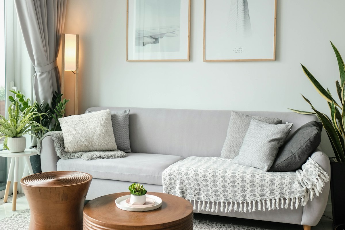
Identify the quieter surfaces that form the room's background and the stronger feature you enjoy. A pale sofa may be the base while a warm table or colored cushion supplies contrast. This is a description of your room, not a formula every home must follow.
Take a simple reference photograph that includes the ordinary arrangement. Add a note naming the physical pieces because a screen cannot guarantee exact color. A future comparison should return to the actual room when subtle differences matter.
Test an existing object first
Choose one retained accessory that might clarify the palette and place it appropriately in its real role. Look again from the same viewpoint. It may repeat a useful warmth, create a clearer dark outline or add a color the group does not need.
Change only that one piece for the first comparison. Moving the artwork, switching cushions and altering the lamp together may improve the room without showing why. A small controlled edit gives the next decision more direction.
Keep texture as an alternative
If the room feels flat, another color is not the only answer. A retained textured textile or a quieter glossy object can change the relationship while leaving the palette restrained. Compare the actual scale of the surface from across the room.
Keep materials suitable for their intended uses and ordinary care. A decorative object should not occupy necessary seating or block equipment to make its color visible. The palette needs to belong to a usable room rather than a cleared styling scene.
Save the group whose main relationships you can describe plainly. When another accessory attracts you, ask what role it would add and whether that role already exists. You can choose a deliberate new accent, but it should enter as a decision rather than an accidental extra. Finding the palette already around you makes keeping a useful object a visible decorating result. It also gives a new purchase a clear reference, so one appealing piece does not quietly trigger several more purchases to explain why it belongs.
Use the sofa, floor and one picture as the first three physical references. Keep an attractive new object beside those actual surfaces before choosing it. If it introduces another accent, decide whether that new role is one you want rather than an accidental extra.
Related reading
A Slow Weekend That Fits Real Life, Considered Gifts Without the Guesswork.
A question or correction? Contact the editorial desk.