Some links on this site are affiliate links. If you buy through a marked affiliate link, we may earn a commission at no additional cost to you. This guide is researched editorial advice; purchases should be checked against current retailer terms. Read our disclosure.
Find the print already present
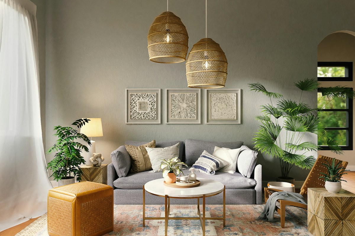
A home corner may contain pattern in a cushion, picture, rug or woven shade. Start with the ordinary room view and identify the print you most enjoy. It may already provide enough detail without another decorative purchase.
Look from the seat or doorway you actually use. A fine pattern can merge into texture at that distance, while a large motif remains distinct. Choose the feature that matters in the complete view rather than the one that looks most interesting in a close photograph.
Give it a quiet neighbor
Compare the selected print beside a plain retained surface. That might be upholstery, a wall or a simple textile. The quieter area makes the pattern's contribution easier to understand without requiring exact matching colors.
Keep the actual household use intact. A sofa still needs the seating people use, and a table still needs its practical surface. Do not create the quiet background by hiding necessary objects in unsuitable places simply to make the image look complete.
Repeat one useful element
If the print feels isolated, look for a retained piece that echoes one visible tone or shape. A modest connection can be enough. You do not need a separate accessory for every color contained in the design.
Try the repeat once and look again before adding more. Several coordinated objects can make the original print less special by spreading the same detail across the whole corner. The useful connection should clarify the group, not require an entire matching range.
Compare scale before adding a second print
A broad wall image and a small textile motif can coexist differently from two equally bold patterns. Look at the actual visible areas and contrast. If both demand attention, decide which should lead before introducing another accessory to mediate between them.
Remove one optional patterned piece temporarily as a comparison. If the room becomes easier to read, the edit may already be complete. A successful corner does not need every pattern you own displayed together.
Keep the smallest arrangement that gives your chosen print a clear place. A simple photograph and the actual object names provide a reference for later additions. Check material care and suitable use when a textile enters everyday seating, rather than choosing only for its decorative surface. One print can make a room feel personal through its ordinary relationship with retained pieces. Once that relationship is clear, the quiet areas around it become part of the choice, leaving the corner complete without another pattern filling each gap.
Start with the chosen print and the plainest suitable retained companion. Add one color echo only after seeing that version. If the pattern already feels connected, leave the extra out and let the quiet surface remain part of the arrangement.
Related reading
Considered Gifts Without the Guesswork, A Reading Nook in a Room You Already Use.
A question or correction? Contact the editorial desk.